Struggling to find content to share on your social media pages?
Stop scrolling through Instagram and Facebook. All you need is REALTOR.ca.
Our consumer lifestyle blog, Living Room, offers content including home improvement, market trends, DIY projects, neighbourhood guides and profiles on unique homes. Living Room publishes exciting new content four times a week (with unique French content for our Francophone fans).
While CREA Café is curated specifically to help your business grow and thrive, Living Room content is perfect to share with your clients.
Owned and operated by the Canadian Real Estate Association (CREA), REALTOR.ca is the No. 1 real estate platform in Canada (Comscore, 2020) with MLS® System listings from across the country.
Share this blog with your clients and followers with the Facebook button below!
You can also follow REALTOR.ca on Twitter, Instagram and Pinterest.
You can read the original blog here.

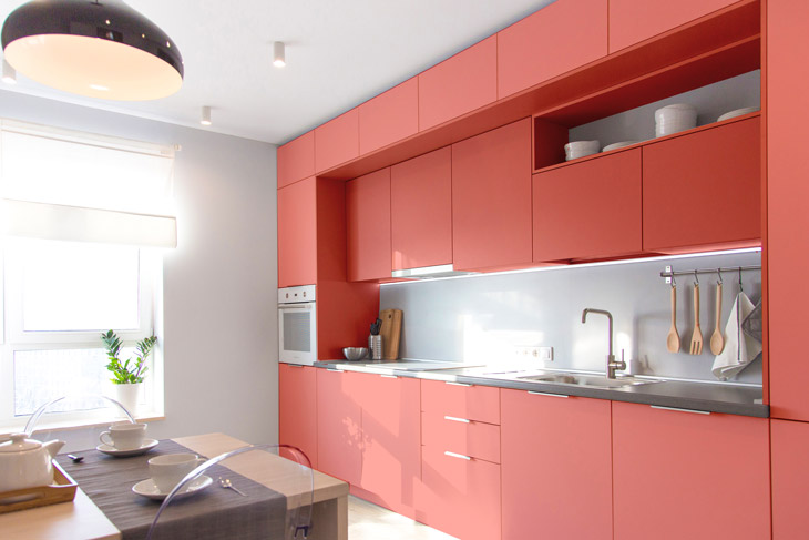
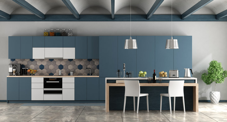
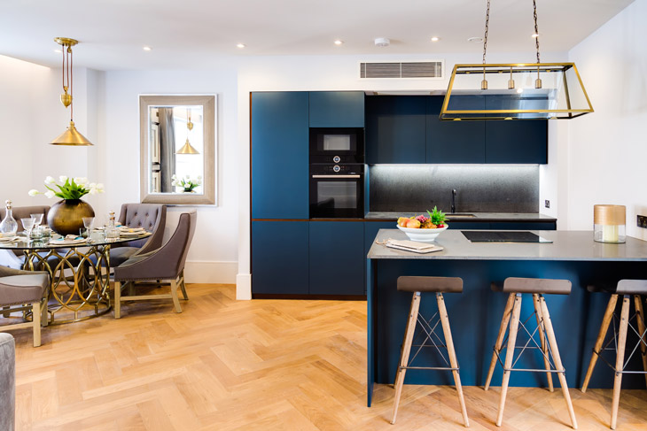
For too long, kitchen designs have opted for the safety of neutral colour palettes. Whites and wood finishes are a great foundation and never go out of style, but for those of us who crave a little more flavour in our lives, you’ll be happy to hear colourful kitchens have made a comeback across Canada.
To spice up your space with some fresh hues, find the best way to choose a palette, appliance considerations and more—read on!
Start with a colour palette
There are a few ways you can go about injecting a little (or a lot) of colour into your kitchen. Depending on your level of commitment, this is a great opportunity to roll up your sleeves and pop open a can or two of paint. Alternatively, there are simple ways to add a nice pop if you aren’t ready for something so dramatic just yet.
Designer and CEO of Sara Lynn Brennan Interiors has some easy-to-remember words of wisdom that she and her fellow designers have relied on for years to create cohesive colour schemes and dynamic designs: “There is a very simple and easy way to come up with a balanced color palette for your space. It’s the 60-30-10 rule! It states that 60% of the room should be a dominant colour, 30% should be the secondary colour or texture and the last 10% should be an accent.”
Need some colour inspiration? Look at the dazzling shades used in Mexican design, Memphis Group design, or see what the Queen of colour herself, India Mahdavi, has to say.

Apply the 60-30-10 rule
Cabinetry often accounts for 60% of the space in the kitchen so if you’re feeling bold, refacing those cabinet doors with a fresh coat of paint will quickly transform the entire room. Tile can easily act as your secondary colour or texture—especially as a backsplash.
A backsplash is essentially an accent wall for your kitchen. So why not forgo classic white subway tiles or monochromatic hexagons currently in vogue for a colourful mosaic or custom tiles that will compliment your dominant hue. The women at Kibak Tile have been creating custom ceramic, hand-painted tiles for more than 40 years and are a great source of inspiration. If nothing else, their ultra-satisfying tile painting videos on Instagram hit the spot when you need to take a break from colour swatching.
A huge hit with renters and those who like to experiment with the latest trends, peel and stick wallpaper is easily the most foolproof method of injecting colour into your kitchen. These options from Wayfair, Rocky Mountain Decals and Spoonflower range from subtle to bold patterns—perfect for reflecting your personality.
Tip: Small spaces can really benefit from a pop of look-at-me colour or patterns. What might seem like a too-loud wallpaper pattern can transform a small kitchen if used sparingly.
For that final 10%, try a textured runner, lush house plants, or unique light fixtures that can serve as your accent, tying the entire kitchen together.

What else can do the heavy colour lifting?
Whether you’re striving to match your range and refrigerator to your cupboard doors, or want to use them as the sole statement piece to layer in some exciting shades, here is the good news.
Manufacturers have started offering colour selections with their large appliances. For example, the DacorMatch Color System, by Dacor even allows you to completely customize your appliances by providing a colour swatch! Dacor puts it best, “the possibilities are limitless.” Their products are hand painted using a high performance, fade-proof acrylic for vibrant colours that can withstand everything the kitchen can throw at it.
Consider accessorizing
If you’re working with a smaller kitchen or a smaller budget, there are plenty of countertop appliances available in dynamic shades for any space that will do the trick easily! Cuisinart’s ceramic bakeware is durable and colourful and will add a pop to any glass-front or open shelf cupboard. Kitchenaid and their iconic stand mixers come in an assortment of classic colours. SMEG is another household name and their cherry pastel will instantly transform your kitchen into a retro dream-they even have an Aesthetic Line for those who can’t get enough of these vintage vibes.
While there are guidelines to add a cohesive colour scheme to your kitchen, that’s all they are —guidelines. Your kitchen sees a lot of foot traffic and is a room for daily gatherings with family — so make sure it’s filled with colours that make you happy. And if that means a fully monochromatic purple look, you do you.


